
While the Obama administration and the mainstream media attempt to paint Americans enjoying a current economic recovery – the facts tell a very different story. After some 5 TRILLION dollars in deficit spending, job growth remains as stagnant as ever under the yoke of the Obama presidency: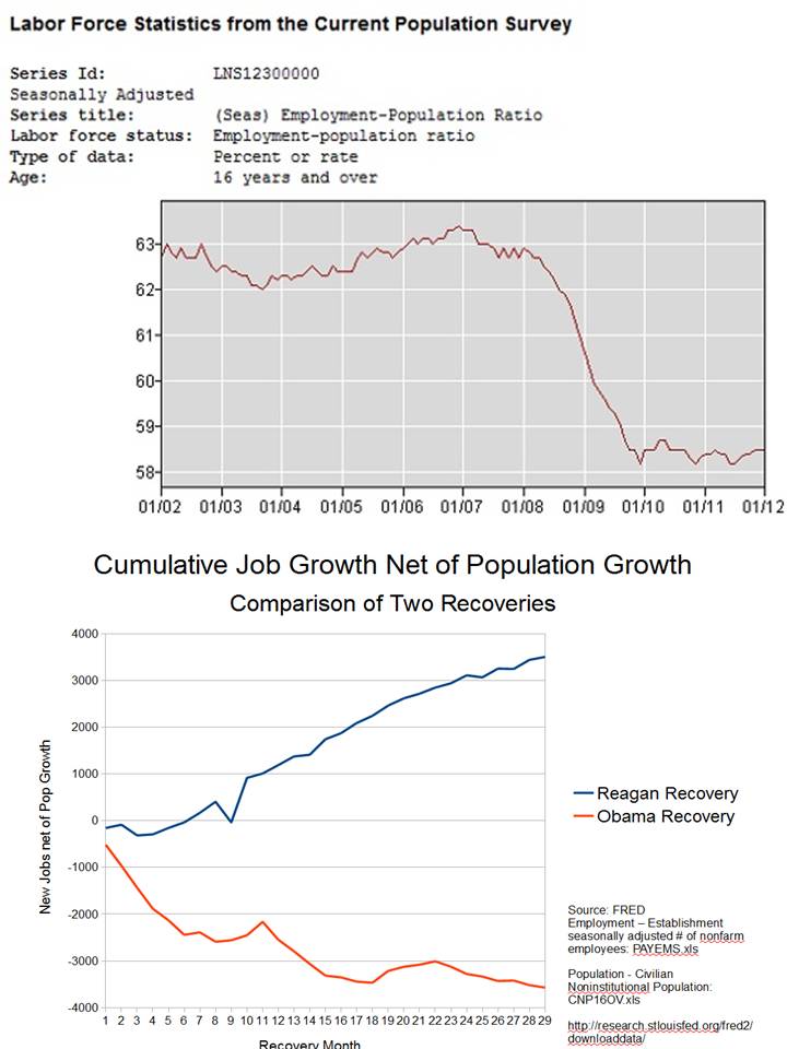
There are a couple of interesting observations to be made from the top graphic from the Bureau of Labor Statistics. One, the steep decline in American jobs correlates to when the Democrats took over control of Congress. Coincidence? Perhaps. But then recall that Barack Obama begins his presidency in 2009 and the decline very much continues well into 2010 where it at least flatlines. 2010 was when Republicans then took control of the House of Representatives and gained a number of seats in the Senate – which the Democrats still control.
$5 TRILLION in lost taxpayer deficit dollars is quite a sum for what that chart reflects – stagnant job growth. Millions who remain unemployed. Millions more who have dropped out of even trying to find work and are therefor not even being counted in the unemployment figures.
For a bit of contrast check out the bottom comparative chart detailing the Reagan recovery vs the Obama recovery. One president charged ahead with plans to greatly reduce taxes, lessen regulations, and pushes to increase domestic energy production in the United States. The other president – Barack Obama, called for more taxes, more regulation, and has fought increasing domestic energy production at every opportunity – such as his shutting down of the much-needed keystone pipeline with Canada.
The truth is clear – the Obama presidency has been a near-complete disaster for working Americans. This might explain a term growing in popularity of late – “ABO” – Anybody But Obama in 2012…
by Ulsterman