As can be expected, because of the drop of the unemployment rate to 7.8%, comparisons of Obama’s “recovery” and the Reagan recovery have been making the rounds.
1. Unemployment Rates are Alike
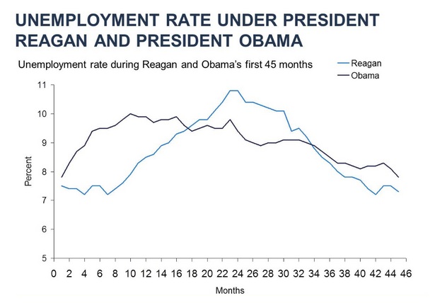
But the reasons behind the drop in unemployment rates are disguised by the above chart.
The chart below shows exactly why the unemployment rate drops: those not in the labor force are at a record 91.8 million.
2. Unemployment Rate Drops as People Leave Workforce
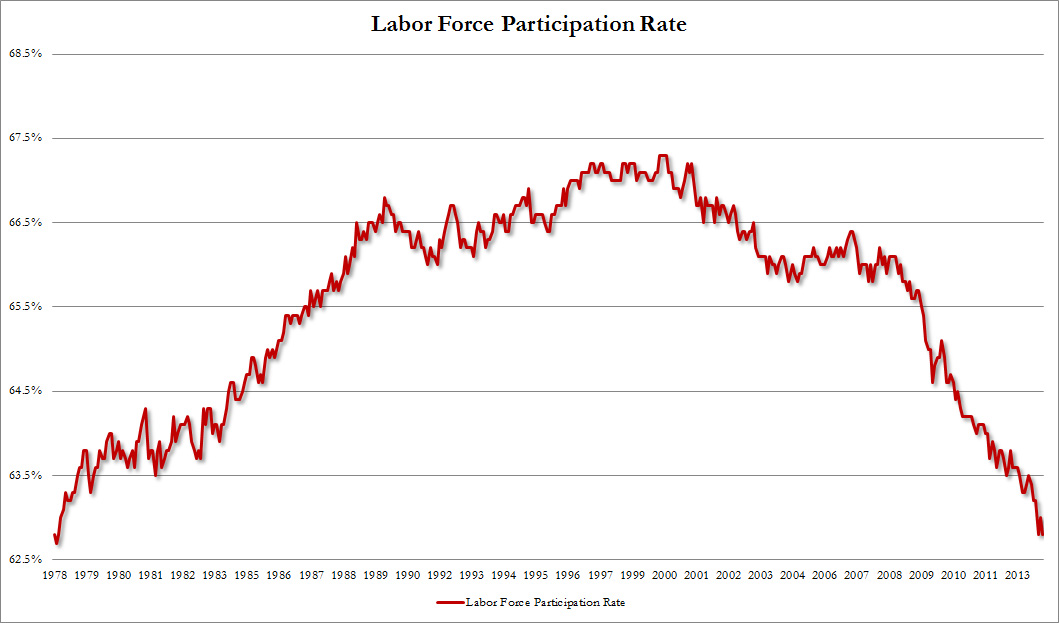
Reagan’s “recovery” came from an expanding labor market, and not from a shrinking one.
Reagan’s economy created 15.8 million new jobs, but Obama’s has only produced 3.2 million over five years. And… fewer people are working now than six years ago.
3. 1,687,000 Fewer People Working Than Six Years Ago

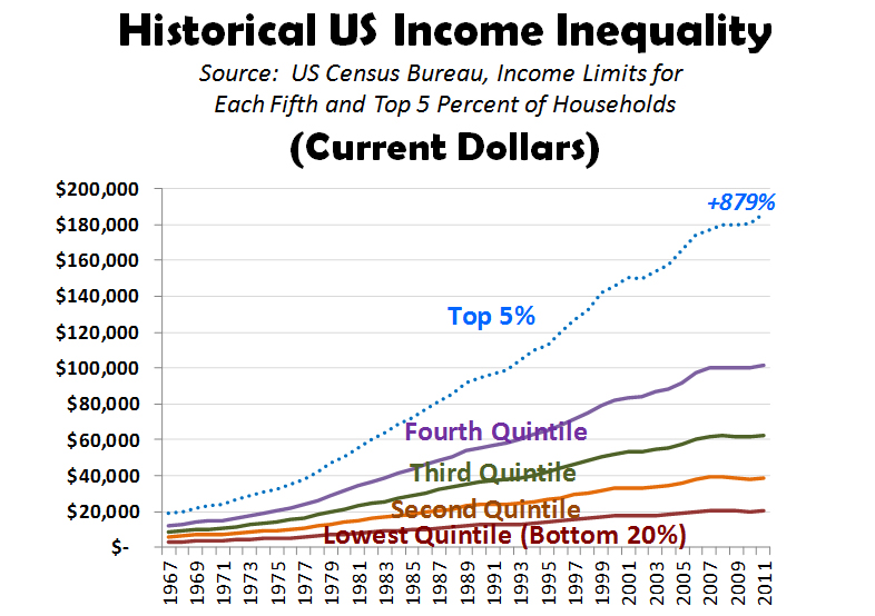
Wait, it gets worse. Reagan-bashers accuse of him of worsening income inequality, which would be the case if we ignore that all income levels rose under Reagan.
These same critics let Obama off the hook for actually worsening income inequality: while the top 1% has made 95% of the income gains, the middle class has been decimated.
4. Income Inequality Worse Under Obama Than Reagan
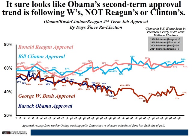
No wonder the American people tended to love Reagan, while Obama is falling out of favor.
5. Obama’s Approval Abysmal Compared to Reagan’s